Goal:
Posters & internal ads Promote contests
Process:
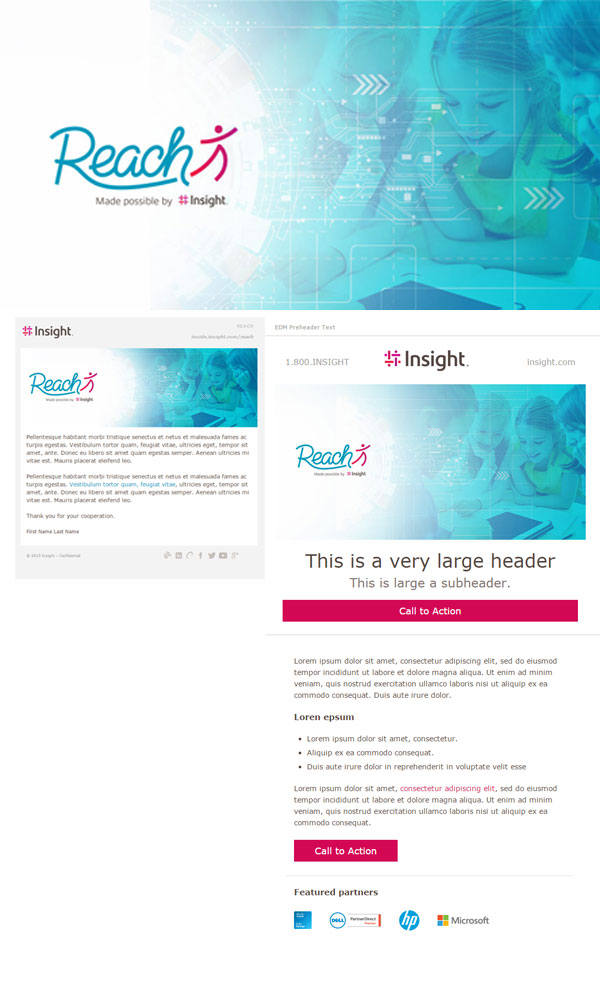
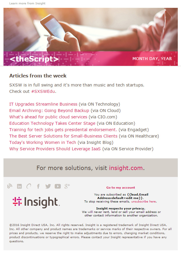
I would receive copy describing the new content that the partner was promoting. Sometimes images were provided but usually, we had the freedom to design what we felt would tell the content the best.
Values Posters:
During Insight’s rebrand structuring, the marketing team was tasked with designing new posters to reflect the new values of the company. Here are some I created.


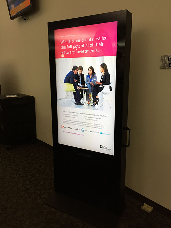
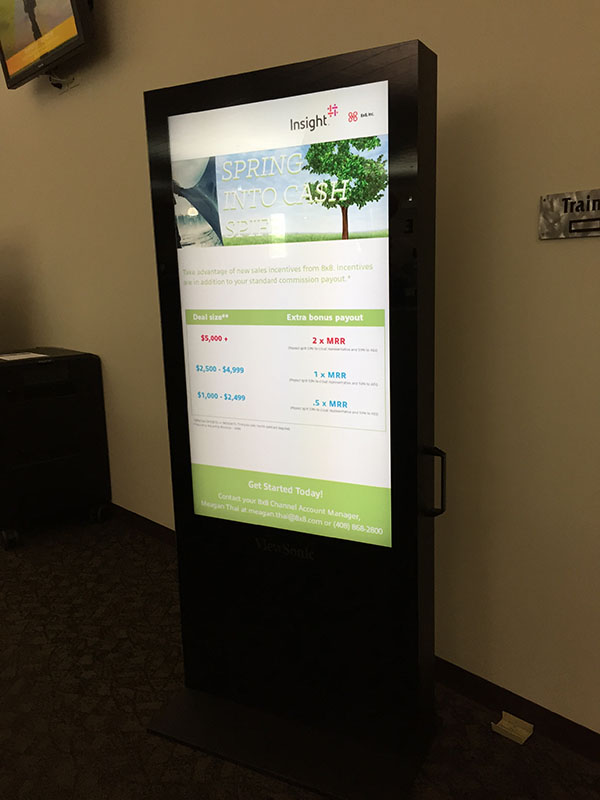
Digital Posters:


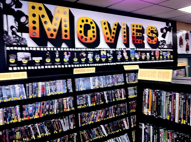
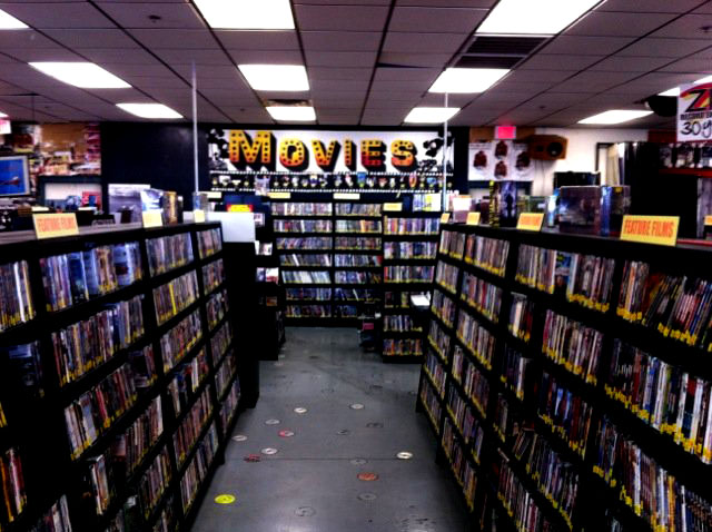
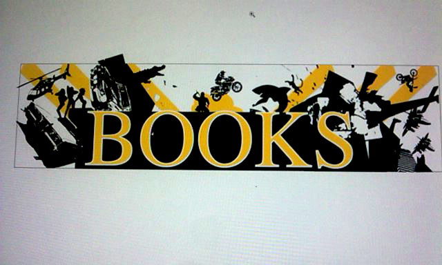
Live Examples:
Display examples. Insight also had several walls with monitors called 4squares. Usually, when a digital poster was created we created a 4Square as well.